Peel an orange in one piece. Now try to lay the skin flat on a table. It tears. It stretches. No matter how patient you are, it will not sit flat without a fight.
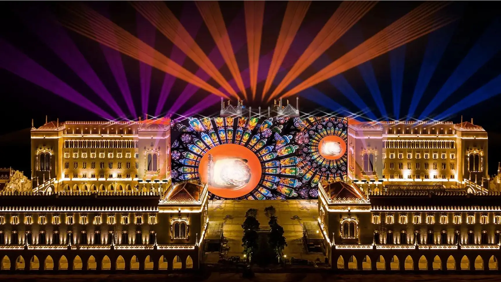
That small kitchen problem is the exact problem we solve when we project onto a dome, a sphere or a curved building. A video is flat. The surface it has to land on is not. Closing the gap between the two is what architectural projection mapping is really about, and it is far more interesting than pointing a projector at a wall.
A standard video is a flat rectangle of pixels. A projector sends that rectangle out in straight beams. On a flat wall, every beam travels roughly the same distance and lands at roughly the same angle, so the picture arrives intact.
On a curve, nothing is that tidy. Some parts of the surface sit closer to the projector and some sit farther away. Some face it head on and others turn away at a slant. The result is a picture that stretches in one spot and squeezes in another, straight lines that bend, and patches that drift out of focus. On a dome or a sphere, there is no single front to design for at all. Even a gentle curve, like a rounded tower or a curved glass front, is enough to pull a grid of straight lines into a wobble.
This is why building projection mapping on anything but a flat facade starts long before the projectors arrive. The content has to be shaped to the surface first.
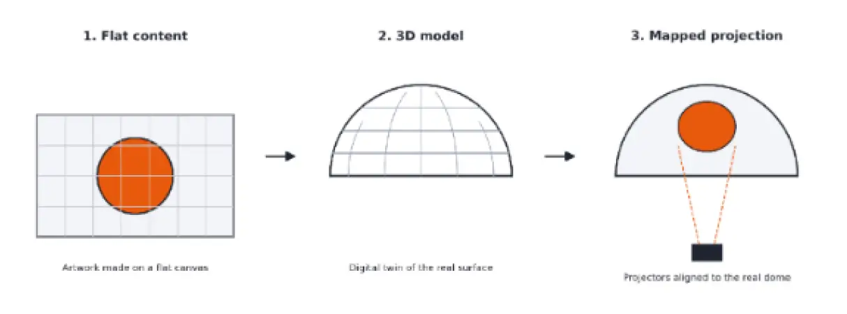
The whole workflow comes down to three moves.
Flat content. Designers start with ordinary artwork and animation on a flat canvas, the same way they would for a screen.
3D model. The real structure is rebuilt digitally, so the artwork can be wrapped around it and previewed before anything goes on site.
Mapped projection. Projectors are aligned so that what the model shows on a computer lands in exactly the same place on the real surface.
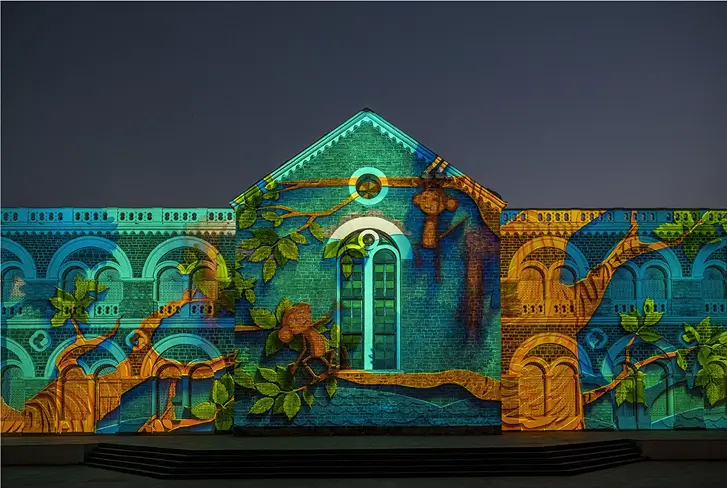
You cannot map what you have not measured. Teams usually start with a 3D scan of the structure, or with architectural drawings checked against measurements taken on site. A laser scanner records thousands of points on the surface and builds a picture of its shape. Photographs can do the same job through a method called photogrammetry, where software works out a shape by comparing many overlapping photos of it, much like your eyes judge depth by comparing two slightly different views.
This matters because real structures rarely match their drawings exactly. A few centimetres of difference in a curve can show up as a visible shift in the picture.
Those measurements become a 3D model, a digital twin of the surface built to the same proportions as the real thing. This is where the creative work happens. Animators design inside the model, so they can see how a moving shape will travel across a curve before a single projector is switched on.
The key idea here is UV mapping, a standard technique in 3D animation software, which Autodesk explains in its Maya documentation. Think of the orange peel again. UV mapping unwraps the 3D surface onto a flat sheet so artwork can be placed on it, then wraps it back so every pixel lands where it should on the model. Good unwrapping keeps distortion low, which means a circle stays a circle even when it crosses a curve. UV mapping only happens inside the software. It fits the artwork to the digital model, and it does not line anything up with the real building. That is a separate job, called projector calibration, and it comes later on site.
Scale makes this harder, not just bigger. Burj Khalifa projection mapping sits at the extreme end of this. At 828 metres, a small error in the model turns into a visible one from the street far below. The larger the surface, the more exact the model has to be. At that size, the surface is usually split into sections, so each projector handles its own patch of the model.
A perfect model still has to meet a real structure. Calibration is the on-site step that makes the two agree. Where UV mapping fits the artwork to the model, calibration fits the projected image to the real structure. Projectors are positioned, then each one is aligned so its image matches the model. Teams project test grids onto the structure and adjust until the grid follows the architecture, with every edge, curve and corner where it should be.
On large surfaces, one projector is never enough. Several overlap, and the edges between them are blended so the join disappears. Brightness and colour are matched across projectors too, because no two units behave identically. Calibration is slow, patient work, usually done at night when the surface is dark and the grid is easy to see. When it is right, nobody notices it. When it is wrong, everybody does.
The same three moves apply, but each shape brings its own problem.
Domes.A dome is often seen from inside, with the audience sitting under a curved ceiling. The picture has to be built for the seats, not just the surface, because the same image looks different from the centre than from the edge.
Spheres.A sphere has no flat side and no natural front. It can be viewed from every direction, so the content wraps all the way round and the projectors have to cover the whole surface, with careful blending where they meet.
Statues and irregular forms.These have deep folds and recesses. Anything a beam cannot reach stays dark, so projectors are placed at several angles to fill the gaps.
The principle underneath never changes. Measure the real shape, design inside a model of it, then align the real world to the model.
We met this problem head on at the FIBA 3x3 Opening Ceremony in the UAE, where we worked alongside PICO Bahrain. The brief covered two surfaces, the basketball court and the canopy above it, and both had to behave as one visual system. The court was the main storytelling canvas. The canopy was the hard part: a curved, non-uniform structure that folded inward like a vortex, with no flat reference point anywhere on it.
A standard workflow did not fit, so we built custom mapping for it and designed the animation to follow the curve instead of fighting it. The inward shape became an advantage, pulling the eye toward the centre of the space. We also designed for the VIP stand, the main viewing position, because what looks correct from the floor can read as distorted from an elevated seat. You can read the full story in our FIBA 3x3 case study.
If you are planning a mapping on a dome, a curved facade or any complex surface, these four questions save the most time. Can the structure be scanned or measured on site before design starts? Where will the audience stand, and what does the surface look like from there? How many projectors will it need, and where can they go? How much time is there for calibration on site, after dark?
Answer them early and the creative work moves faster, because the model, the content and the projector positions are all working from the same facts. Leave them late and the surprises show up on site, in the dark, with a client watching.
Curves are where projection mapping stops being a screen and becomes a craft. To see more of how we work, explore our Projection Mapping service page.